William P Hall (PhD)
President, Kororoit Institute
Evolutionary Biology of Species and Organisms
Presentation for download Reposted from here
1. Introduction
This essay presents some observations on how the Earth’s climate has changed during the era of satellite observations beginning in 1979 when it became possible to see the planet as a whole world has changed through that time. The observations of how our planet has changed are real. What they are telling us about our future is open for interpretation. The majority of climate scientists think they paint a picture of a rapidly warming (at least in any geological or ecological sense) world, where the rate of warming over the last few years has been accelerating.
Our world’s climate is a chaotic and highly complex system. As such it is impossible to make exact predictions how climate will change over the next few years or decades. However, we can consider how climate may continue to change in terms of risk. This is discussed in the concluding Section 7. How should we react to the observed global warming? The observations show a growing risk to human society from runaway global warming, and they beg explanation. Arguably climate variation in the Arctic Region, and especially the area of the Arctic Ocean drives global climates through its effects on the location and behavior of the Northern Hemisphere’s jet streams (see A Rough Guide to the Jet Stream: what it is, how it works and how it is responding to enhanced Arctic warming) and ocean currents extending through the Atlantic Ocean from the Arctic to Antarctic and from there into the Pacific. For an explanation of how this can be see Wikipedia’s Thermohaline Circulation and Shutdown of Thermohaline Circulation, and also Section 5.3, below. It is also the case that the Arctic as a whole appears to be warming at something like twice the rate of the rest of the planet.
This essay focuses on observations of what appears to be the start of runaway warming in the Arctic that may have profound effects on global climates over the next few years; and a plausible cause – the warming driven release of methane gas from permafrost forming a strong greenhouse cap over the Arctic Ocean. Evidence shows that over the last few years winter cooling over the Arctic Ocean has been significantly retarded when the sun is below the horizon for months at a time when heat absorbed over summers with 24 hour daylight should be radiating away to outer space. However, during the late autumn and winter over the last two to three years, monthly average temperatures over large areas of the Arctic Ocean have been as much as 20+ °C!! hotter than the 1989-2000 baseline averages for the same months.
The observations summarized here are based on computerized analyses of many millions of data points collected per day covering the entirety of the satellite era, beginning in 1979. To encapsulate summaries with the minimum of text and numeric data, I have used a number of animated maps where primary data is encoded in color. Changes in this data over time intervals ranging from days to months and years are shown as a stack of gif images forming short movies.
To me, in addition to a continuing rise in arctic temperatures, the most conspicuous indication that we may have passed a tipping point where arctic warming is increasing at an ever faster rate as shown by the graph below. This depicts changes in the areas (extents) covered by sea ice on the whole planet. Over the half year on each day of the year the area of the globe covered by sea ice has been by far the lowest it has ever been in the satellite era for those days and from 7 January until around 9-10 March – a period of two whole months – there has been less sea ice on the planet since the previous record low recorded in mid February 2016. Such a major deviation from “normal” indicates there are currently some serious climate changes taking place in the world.
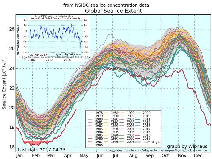
Figure 1 – Data from the US National Snow and Ice Data Center for 23 April 2017 plotted by Wipneus. Click here for the most up-to-date plot of this graph and related graphs and explanation.) The red shaded area of the graph highlights daily extents lower than any low extent recorded in any previous year since 1978. The inset graph shows changes in the deviations from the mean value over the last 10 years. In November 2016 this reached nearly 8 standard deviations(σ), with the current reading around 4 standard deviations – where there is a chance of less than about 1 in 15,000 that such a deviation could occur by chance. The value is now hovering between 3σ and 4σ.
After introducing the agencies that collect and plot the climate observations, I’ll explore the observational data supporting these findings in more detail.
2. Global monitoring agencies
Several government agencies around the world use various observational tools to measure weather. These include simple recording thermometers measuring ground and air temperature together with wind speeds and direction and cloud cover at designated weather stations, balloon lifted radiosondes to plot temperature profiles of the atmosphere above the weather stations, similar measurements made by ships and floating buoys at sea, and a variety of satellite-based remote sensing systems . Together with electronic communications and automated data processing their daily and more frequent readings provide a global picture of weather and climate.
The kinds of observations collected include temperature at a variety of heights above the ground, sea surface temperature, precipitation and clouds, location and depths of ice on land and over the ocean, mean sea level pressure and pressure at a variety of elevations above mean sea level, precipitable water, surface winds, jet stream winds and a variety of other variables collected on a more limited basis, such as concentrations of various kinds of gases in the atmosphere. These observations provide input for a variety of weather prediction and climate change models where values and changes can be visualized on a global basis.
Major sources of information relating to the raw observations and how they are collected include NASA, the US National Oceanic and Atmospheric Administration (e.g., Climate Monitoring; National Snow and Ice Data Center – Arctic/Antarctic Sea Ice Analysis and News), Goddard Space Flight Center – e.g., GIS TEMP JAXA (Japan Aerospace Exploration Agency), European Space Agency, Australia’s Bureau of Meteorology and the CSIRO Climate Science Centre, and a variety of other national meteorological organizations around the world. To now the US agencies, NASA, NOAA and NSIDC have provided the most comprehensive weather/climate monitoring and tracking, yet US President Donald Trump claims that would be good for America and the world to shut them down.
Three particularly useful services automatically process and digest the millions of individual daily observations into consistent and coherent global visualizations: ClimateReanalyzer.org (Climate Change Institute, University of Maine), Weather BELL Models (Weather Bell Analytics), and Earth (Cameron Beccario @cambecc. These show daily variations in weather and long term histories of climate change on global and regional scales.
3. How is global climate change measured and visualized?
Although daily variations in local weather are to some degree governed by changes in regional and global climates, weather observations recorded by instruments at single locations are generally poor indicators of broad-scale climate variation. For example, global warming or cooling may cause jet streams or ocean currents to change in ways that move the average local temperatures in opposite directions to the larger scale temperature trends.
Only by plotting measurements from all available sensors systems meeting appropriate quality criteria can we map regional and global weather patterns. And only by tracking changes in these large-scale weather patterns over a number of years can we construct long-term climate changes globally. To maintain consistency and accuracy, climate scientists periodically review the instrumentation and locales of the weather stations used for climate measurements to adjust for factors such as, e.g., moves of the stations or increasing urbanization around the stations.
In the satellite era, remote sensing platforms orbiting around the planet collect data for constructing global maps of temperature, humidity, extent of snow and ice, wind, waves, currents, and various other variables affecting climate. Continuing cross comparison between satellite observations and records from instruments in the atmosphere or on the planetary surface helps to ensure that the various sensors are measuring the same things and to help ensure that the older instrumental records are coherent with the current satellite + instrumental observations. Also, the development of supercomputer systems able to process the hundreds of millions of data points collected every day has removed a lot of subjective bias in analyzing the data to produce products visualizing climate variation as illustrated below.
When considering changing temperatures over time, the concept of an “anomaly” – the deviation of the value for a specific geographic location and time or period compared to the value at the same location averaged over .a specified “baseline” period is used to represent the change (see also Wikipedia). The animated graphic below compares the computed annual average temperature at each pixel on the map with the computed average temperature over the baseline period of 1979-2000.
I have prepared animations unique to the present document using the GNU Image Manipulation Program (GIMP). Most of the animations use daily and monthly maps of global temperature anomalies plotted from NASA data by the Climate Change Institute at the University of Maine. These maps and a variety of others can be accessed on http://cci-reanalyzer.org/. Temperatures refer to air temperatures measured at 2 meters above sea level (temperatures of mountainous regions are adjusted to the sea-level reference height using well known and understood physical laws). The range of anomalies charted range from -4 °C below baseline (bright lavender) to +4 °C above baseline (bright red). One animation and some of the static maps are sourced from WeatherBELL.
Animations show the changing nature of the yearly average temperature anomalies over the period of satellite observations beginning in 1979.
Figure 2 – Annual temperature anomalies over the planet from 1987 to 2015 compared to a 1979-2000 baseline (Click graphic for animation / click Back when finished viewing). The year for each image is shown at the upper right corner of the map. Years with strong El Niños are indicated by the streak of brownish to red (i.e., warmer) water extending west along the equator from South America as shown in the 1979-200 image. Strong La Niña conditions are indicated by the streak of blue (i.e., cooler) water extending west from South America. The animation shows that In the baseline years (through about the year 2000) there are only relatively small positive and negative deviations over most of the planet, with perhaps a higher frequency of extremely negative anomalies. As the end of the sequence is approached (i.e., after ~2000), positive anomalies become more extreme and more wide-spread, with large areas in the Arctic showing temperature anomalies of 4 °C or more. WeatherBell’s anomaly map for 2016 shows large areas over the Arctic Ocean 5 – 7 °C above a 1981 to 2010 baseline that is already slightly warmer than ClimateRenalyzer’s 1979-2000 baseline.
The animation above is what climatic warming looks like on a global scale. Watching the changes in detail, note that the area of the Arctic Ocean around Novaya Zemlya Islands off northwestern Siberia (the area near lower right hand corner of the following polar projection map) remains persistently hot from around 2005 through 2015 (i.e. 3-4+ °C hotter over the whole year than the average temperature recorded for the 21 baseline years). (Click the links in the figure caption below the map to identify the locations of the geographic features referenced).
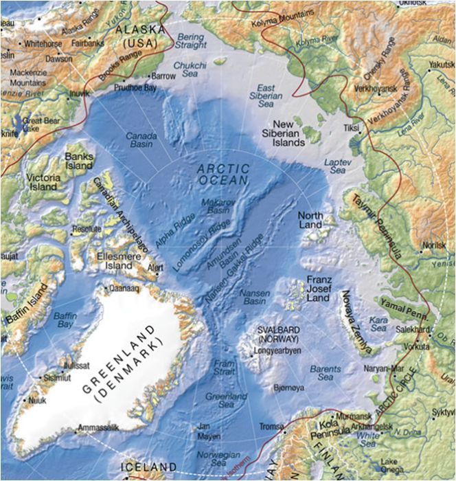
Figure 3 – Geography of the Arctic region (modified from Nordpil – the red line is the 10 °C isotherm). Land masses serving as geographic markers in and around the Arctic Ocean include Alaska, the Canadian Archipelago, Greenland, Svalbard/Spitsbergen (between Greenland and Novaya Zemlya), the Franz Josef Land Archipelago (north of Novaya Zemlya), Severnaya Zemlya (east of Novaya Zemlya to the north of central Siberia) and the New Siberian Islands (an archipelago north of Eastern Siberia). Links above and below describe and show in more detail the geographic locations of the named markers. Subdivisions of the Arctic Ocean that are often open water during the summer include the Bering Strait (connection to the Pacific Ocean between Siberia and Alaska), Chukchi Sea (north of Bering Strait between Siberia and Alaska), Beaufort Sea (north of Alaska and Canada between the Chukchi Sea and the Canadian Archipelago), Wandel Sea (north of Fram Strait) – Fram Strait (between Greenland and Svalbard – the only deep water connection between the Arctic Ocean)- Greenland Sea (south of Fram Strait), Barents Sea (between Norway, Svalbard, Franz Josef Land, Novaya Zemlya and Russia), Kara Sea (between Novaya Zemlya, Franz Josef Land, Severnya Zemlya, and Siberia), Laptev Sea (between Severnya Zemlya and New Siberian Islands), and the East Siberian Sea (north of eastern Siberia, between the New Siberian Islands and Wrangel Island/Chukchi Sea).
Given the way that the Mercator projection used for the animation above greatly exaggerates the polar regions, it is difficult to understand the actual geographic extent of the polar anomalies. Most of the remaining temperature and ice cover observations will be depicted on a planetary globe rather than flat maps. This shows the Arctic Ocean in truer perspective.
4. Observations
4.1. Arctic temperature anomalies
Looking down on the North Pole, the first global view animates the anomalies in yearly average temperatures for each year from 1979 through 2015: Over the baseline period from 1987 through 2000, moderately cooler and moderately warmer periods are about even over the Arctic Ocean. Beginning around 2005 anomalously hot areas over the Arctic become larger and more frequent. In 2015 – then the hottest year on record for the planet, much of the area over the Arctic Ocean is at least 4 °C warmer than average for the baseline period.
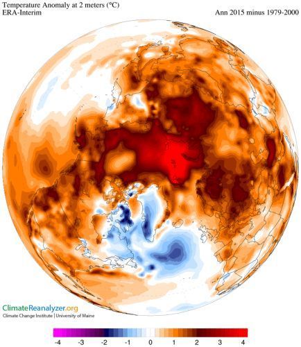
Figure 4- ANNUAL: Animated polar view of annual anomalies in the yearly average temperature of the Northern Hemisphere for each year from 1979 through 2015 compared to the average temperature for the baseline period 1979-2000 (Click graphic for animation / click Back when finished viewing). The year covered by each image, e.g., Ann 1979, is displayed in upper right corner of each image. (Climate Reanalyzer).
Counterintuitively, the greatest contribution to the annual anomalies for the Arctic Ocean is from excessively warm autumn and winter months (the “dark season”), when there is no solar heating because the Sun is below the horizon for most of the time.
Summer anomalies over the Arctic Ocean are generally not extreme over the entire period 1989 through 2015 because the region receives virtually the same amount of solar energy each year and excess heat retained by a stronger greenhouse cap is probably absorbed by the increased melting of sea ice. One gram of liquid water heated by 1 °C absorbs one calorie; but it takes ~80 calories to turn one gram of ice at 0 °C into liquid water at 0 °C !
However, over the autumn months of September, October and November the average heat anomaly for the season begins to increase markedly in the years after ~2000. Note that the temperature scale on the map extends to ±5 °C, and that in the later years areas of the brightest red may have heat anomalies in excess of 5 °C. The next two global animations show the autumn and winter anomalies from 1979 to 2015. The increasing heat anomalies over the Arctic, and especially the Arctic Ocean are consistent with the apparent development of a greenhouse cap in the current century.
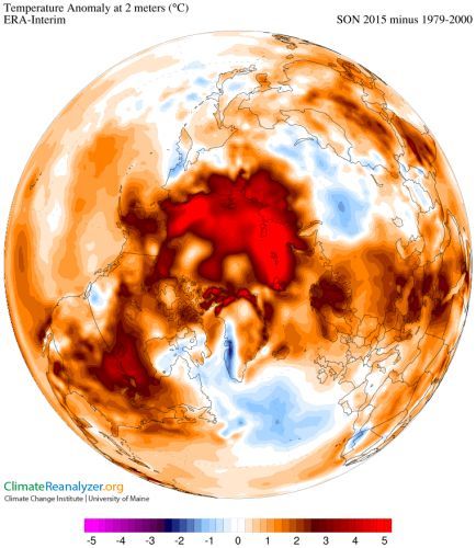
Figure 5 – AUTUMN: Animated polar view of annual anomalies in the average temperature of the Northern Hemisphere for the autumn period inclusive of the calendar months of September, October, and November of each year from 1979-2015 compared to the average temperature for the 1979-2000 baseline period (Click graphic for animation / click Back when finished viewing ). The period covered by each image, e.g., SON 1979, is displayed in upper right corner of each image (Climate Reanalyzer).
The situation is similar for December, January, and February as shown below, when sunlight never reaches the pole (the sun doesn’t rise over the pole before the vernal equinox, around March 20).
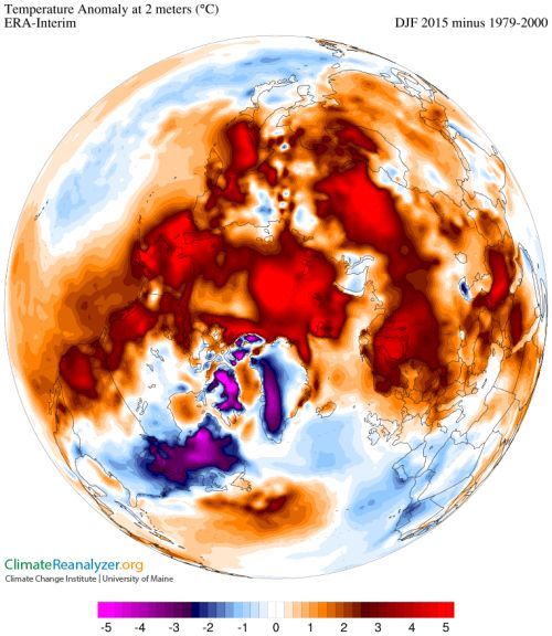
Figure 6 – WINTER: Animated polar view of annual anomalies in the average temperature of the Northern Hemisphere for the Winter period inclusive of the calendar months of December, January, and February of each year from 1979-2015 compared to the average temperature for the 1979-2000 baseline period (Click graphic for animation / click Back when finished viewing). The period covered by each image, e.g., DJF 1979-1980, is displayed in upper right corner of each image (Climate Reanalyzer).
To explore the temporal changes in these anomalies more sedately, go to Climate Reanalyzer’s Monthly Maps, and set the following boxes from their defaults: Parameter = Mean Temperature 2m; Projection = Globe; Region = Northern Hemisphere; Month (options are annual, specific month, 3 monthly period – DJF, MAM, JJA, SON); Start/End = years); Span (Single/Multiple: Multiple gives you the opportunity to set a span of years); Plot Type (Average/Difference: average shown the average temperature for the selected period; Difference shows the temperature anomaly for the first span compared to the selected baseline span you select).
Climate Reanalyzer’s Daily Reanalysis Maps provide a tool for observing animations of daily temperature variations over a period of a selected month. This is updated a couple of weeks after the end of each month. 5-day Forecast Outlook Maps gives you a tool for projecting the average weather over the next five days.
The trends of greatly increasing temperatures over the Arctic Ocean in autumn and winter observed through the end of 2015 grew even more extreme in 2016. These are animated on the WeatherBELL map, where the Month to Date plot is updated daily until the month is completed, and the next month’s plot begins.

Figure 7 – Anomalies in average temperature over the world for each month of the calendar since January 2016 through March 2017 compared to averages for the same months in the baseline years 1979-2010. ((Click graphic for animation / click Back when finished viewing – WeatherBELL data).
Note that WeatherBELL uses a somewhat warmer baseline (1981-2010) for measuring its anomalies compared to Climate Reanalyzer’s 1979-2000 baseline. Orange and brownish red areas in the arctic represent anomalies between 1 and 7 °C, grey to white are anomalies between 7 and 10 °C, white to pinkish red are 11 to 16 °C hotter than the baseline for the same month. The maximum anomalies shown are +16 °C.
Last year, 2016, was the hottest year on record since temperatures were recorded, for the third year in a row (see NASA, NOAA Data Show 2016 Warmest Year on Record Globally). As shown in the animation above, January 2016 temperature anomalies for significant areas over the Arctic Ocean north of Scandanavia and western Siberia averaged +10° or more above the baseline, with small areas between Svalbard and Franz Josef Land Archipelago and between Franz Josef and Novaya Zemlya as warm as +15° above the baseline. In February the extent of these warm areas increased significantly, followed by March with very similar distributions to those observed in January. In April and May the magnitude of the anomalies diminished to +4-6°, and almost disappeared in June, July and August. In September much of the area over the Arctic Ocean showed an anomaly of +3-5°. In October the average anomaly over much of the Ocean was 5-11° above the baseline. In November the monthly average anomaly ranged an insane 10-16° above the baseline. In December) the polar area above latitude 80 or so still averaged 10-12° warmer than the baseline with some exceptionally warm spikes. In January and February 2017 there will still patches that averaged 11° above the baseline around Novaya Zemlya, and in March the 10-11° patch extended south into north-central Siberia and out into the Arctic Ocean north of eastern Siberia.
In the animation, also note the switch from El Niño conditions that existed in the beginning of 2016 (indicated by the reddish streak of warmth extending west along the Equator from South America) to La Niña in April and May (when a blue streak begins to replace the red west of South America) and continues for the rest of the year. By January 2017 there are already hints of a new El Niño forming along the Equator west of Peru that becomes stronger in February and March – the shortest interval between El Niños known to date. The high ocean temperatures off Peru led to extensive and unseasonal flooding in Peru.
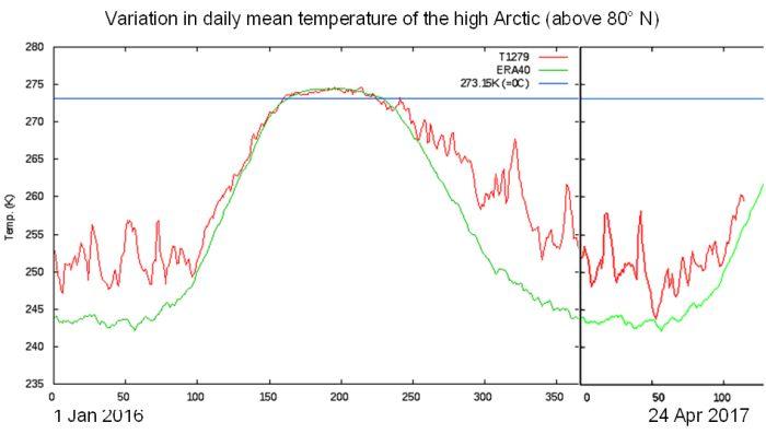
Figure 8 – Daily mean temperature variation in the high Arctic (above 80° N) from 1958 to 24 April 2017 compared to a 1958-2002 baseline – (Danish Meteorological Institute). (Click graphic for animation / click Return when finished viewing. The solid red line is the calculated mean temperature over the high Arctic in degrees above absolute zero (°K). The solid green line is the baseline temperature variation over a 1958-2002 baseline. The horizontal blue line is the 0 °C melting temperature for ice. From 1958 to 2000 the frame rate is one second per year – demonstrating only slight and random variations from the average temperature for the day over the year. From 2000 to 2010 the frame rate is two seconds per year, and from 2011 to the present it is 3 seconds per year. In 2002 the algorithm for plotting the temperatures was changed and the two systems were run in parallel for half of the year. Both plots are shown, which accounts for the doubling of the variation line for that year. Note that there is little difference between the two algorithms. From 2010 to 2017 the frame rate is three seconds per year. In 2012 the daily temperatures begin to deviate significantly from the long-term average behavior. In 2016 winter temperatures were averaged a good 10 °C higher than the long term average.
What this long time series shows is actually quite important. Aside from variations due to weather fluctuations and a slight random variation around the the long term averages, the behavior of temperatures in the high Arctic above 80° N latitude remained fairly stable through around the year 2000. Then, beginning around 2005 dark period temperatures began rising with a considerable acceleration in the rate of temperature increase around 2012. By 2016 the average anomaly was an insane 10 °C over the long term average. 2017 so far is also quite hot.
On 22 December the closest weather buoy to the North Pole (300234064010010 – about 145 em S of the Pole) recorded a temperature of 0 °C (see Weather buoy near North Pole hits melting point – Washington Post 22/12/2016, for more detail). On 11 February 2017 at 87.18° N, 176.39° E and 17:00 local time in the middle of the Arctic Ocean the air temperature was -3.0 °C !! (see earth.nullschool.net).
In March 2017 there are large anomalies over the Arctic Ocean north of eastern Siberia (up to +10-11 °C) over western and eastern Siberia mainland and most of Antarctica are also anomalously warm. Only Alaska and western Canada are cool (between -4 and -2 °C). El Nino conditions are beginning to be evident along the equator west of Peru (see also Section 4.2 – Today’s weather), and in March there was a significant amount of warm water along Australia’s east coast that contributed to the severity of Severe Tropical Cyclone Debbie that lashed 1,300 km of the eastern seaboard and slopes with category 4 winds and catastrophic flooding.
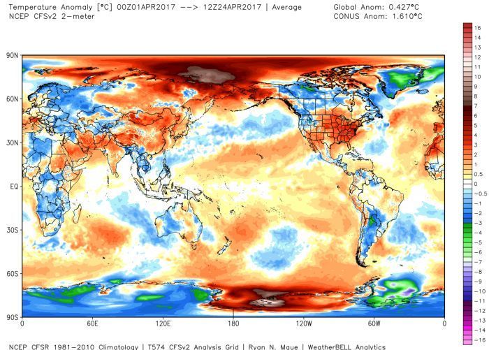
Figure 9 – Global average temperature anomalies for the first 23 days of April 2017 relative to the 1981-2010 baseline for the same period. (WeatherBELL) . Note the significantly warm (7-9 °C) anomaly over the Arctic Ocean north of eastern Siberia. The only significantly cool area is Greenland. The Tasman Sea east of Australia shows a cooling possibly left over from Ex Tropical Cyclone Debbie cooling the surface waters by mixing them with cooler deeper water. There are signs of a developing El Nino in the Eastern Pacific along the Equator off Peru. The Ross Sea off Antarctica has the hottest anomaly for the time period on the planet.
The striking warming of the air over the Arctic Ocean and adjacent continental margins has consequences. Arctic sea ice is disappearing at an accelerating rate, with new minimum areas of ice coverage being reached almost every September.
4.2. Today’s weather
For more than a year, every time I update this document, today’s weather shows no signs that global warming has stopped. In fact, the usual outlook is noticeably worse. ClimateReanalyzer provides a good window on our changing weather. “Today’s Weather Maps” displays the latest information for a range of weather/climate variables: Temperature, Temperature Anomaly, Sea Surface T Anomaly, Precipitation & Clouds, Mean Sea Level Pressure, Precipitable Water, Surface Wind, Jetstream Wind, Sea Ice & Snow.
Two of these plots are represented here, with comments on associated weather events.
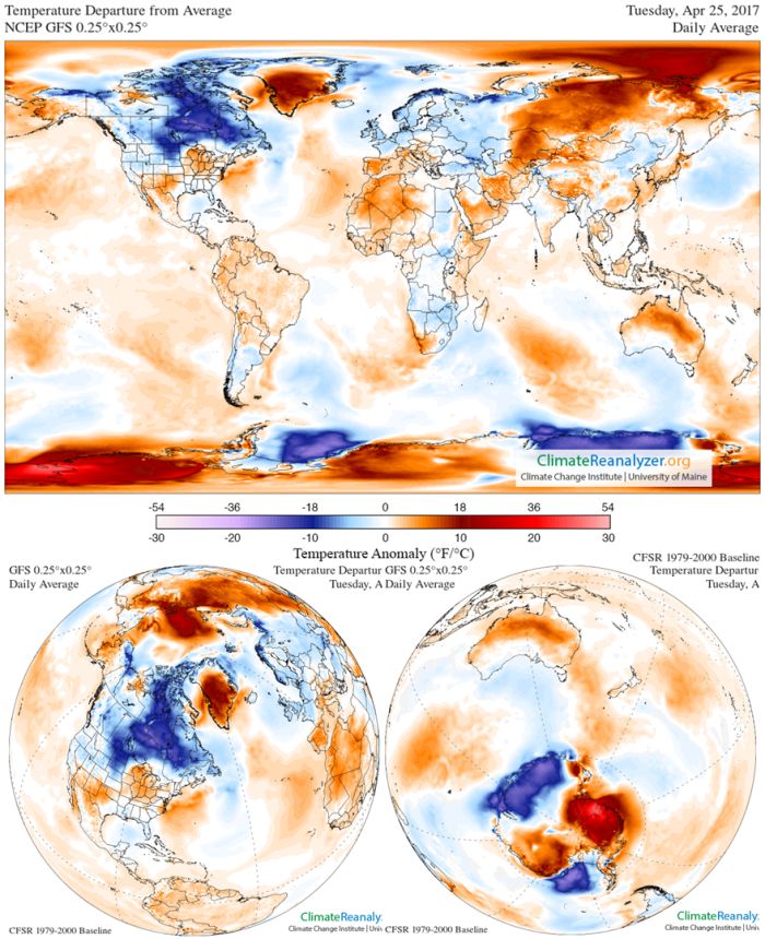
Figure 10 – Global Temperature Anomalies for “Today”, 7 April 2017 (ClimateReanalyzer). Note the the large heat anomaly (> 13 °C) over Arctic Ocean north of eastern Siberia and North America. In the Southern Hemisphere there is a strong >20 °C anomaly over the Ross Ice Shelf and adjacent West Antarctica..
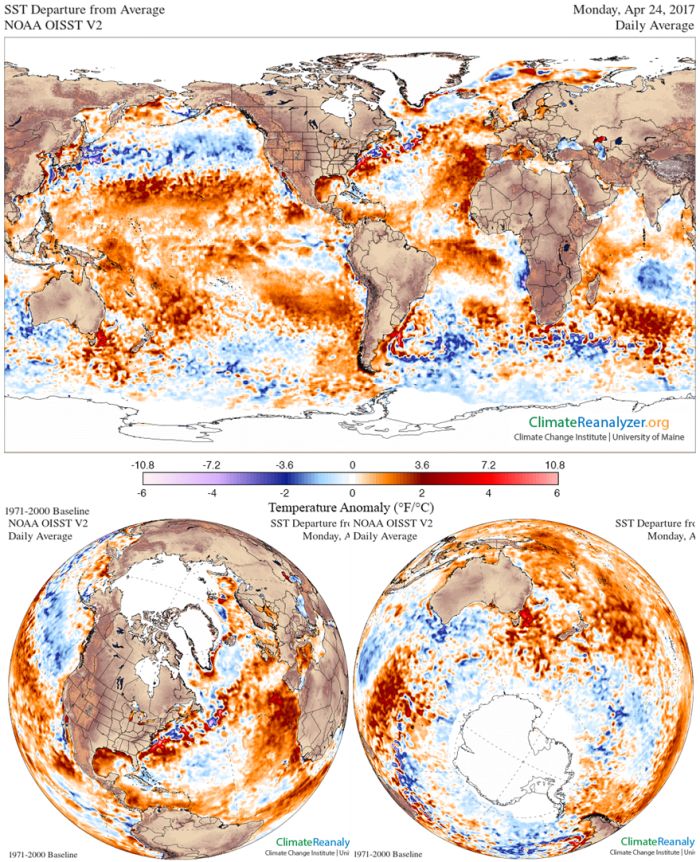
Figure 11 – Global Sea Surface Temperature Anomalies for “Today”, 7 April 2017 (ClimateReanalyzer). Note the warm water (> +2 °C) along the edge of the Arctic Ocean ice cap from north of Iceland eastward north of Norway and European Russia where it will be actively melting oceanic ice,. Most areas of the tropical and subtropical oceans show considerable heating, with a particularly warm patch off south eastern Australia. .
4.3. Polar sea ice
The unprecedented heating of the Arctic as shown in the observations above is associated with (as a cause?) an equally unprecedented melting of the cap of sea ice floating on the Arctic Ocean. This is shown over the period from the minimum of September 1984 through September 2016 in an animated video from the US National Astronautics and Space Administration (NASA).
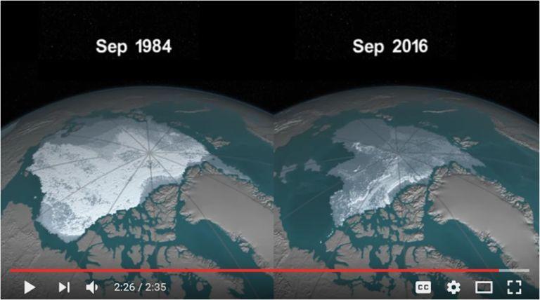
Figure 12 – The remarkable loss of Arctic sea ice over the period from Sept. 1984 to Sept 2010 Note: the age of the ice is indicated by how white it is. The thinnest, year old ice is shown as grey, the thickest ice, 5 or more years old is shown in bright white. (Click picture above for NASA’s animation and narration).
The progressive reduction in extent and thinning of ice on the Arctic Ocean since 2012 is shown particularly clearly in ice charts produced by the US Naval Research Laboratory HYCOM Consortium for Data-Assimilative Ocean Modeling. The US Navy is, of course, greatly concerned as to the navagability of the Arctic for its warships and submarines. NRL also provides daily images for sea ice concentration, thickness and speed/drift since 2012 and animated views of changes in ice cover for the last year and the last 30 days for concentration, thickness and speed/drift select preferred gif).
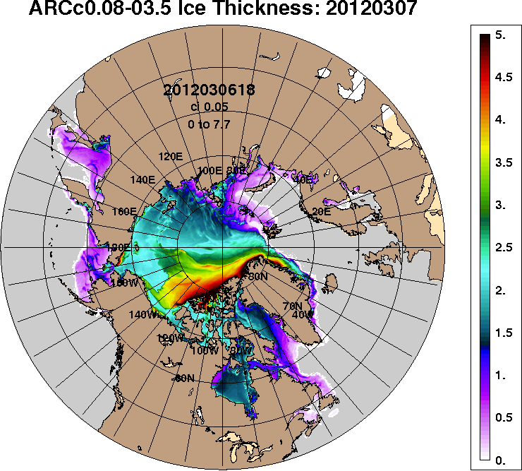
Figure 13 – Thinning of the ice cover: snapshots for 7 March 2012 to 2017. 7 March was this year’s maximum extent. (Click graphic for animation / click Return when finished viewing) These shots are selected from CICE ice thickness – Snapshot Archive. Even by 2014, 5 m thick ice is almost gone and 3 m thick ice is substantially diminished. In the 2017 snapshot all ice thicker than 3 m (green) has virtually disappeared except hard along the north coast of the Canadian Archipelago and Greenland. This year on 7 March over two thirds of the iced over area of the Arctic ocean is covered by ice that is less than one and a half meters thick (lavender to dark blue and grey).
The anomalously warm arctic has impeded autumn and winter ice formation in 2016-2017 compared to previous years as shown in the National Snow and Ice Center’s most recent plots of ice extent. Sea ice in the Arctic and the Antarctic set record low extents every day in December 2016 and January 2017 so far, continuing the pattern that began in November (NSIDC Arctic Sea Ice News and Analysis – 5 Jan 2017; see again the Fig. 1 ). March 7 recorded the lowest Arctic extent ever recorded (NSIDC Arctic Sea Ice News and Analysis – 22 Mar 2017) with the average for the month also the lowest ever recorded (NSIDC Arctic Sea Ice News and Analysis – 11 April 2017) Please note that all of the following graphs of sea ice coverage are based on detailed satellite observations as mapped using 25 km x 25 km grid cells.
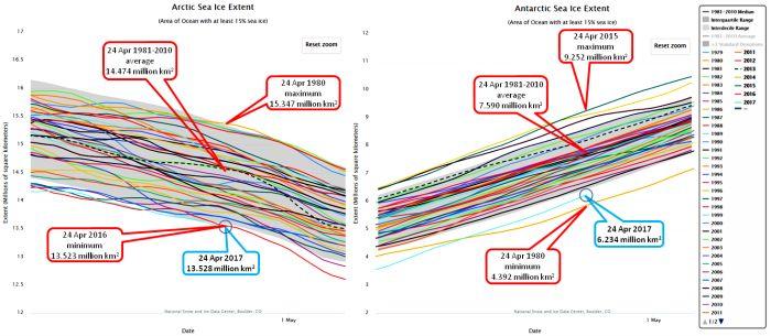
Figure 14 – Daily changes in the extent of sea ice in both the Arctic and Antarctic Oceans from 1979 through to 24 April 2017. (graphs prepared using the Charctic Interactive Sea Ice Graph using the publicly available satellite data on sea ice from the US National Snow and Ice Data Center). Shading represents ±2 standard deviations from the daily average cover during the baseline period. The Arctic ice extent is only 5,000 km2 more than the lowest ever recorded for this date, while the Antarctic ice extent is the second lowest extent recorded for this date.
Not only are this year’s extents at or close to record lows, but much of the existing ice is fragmented with a lot of exposed ocean within the extent, as shown on the maps of sea ice concentration next:
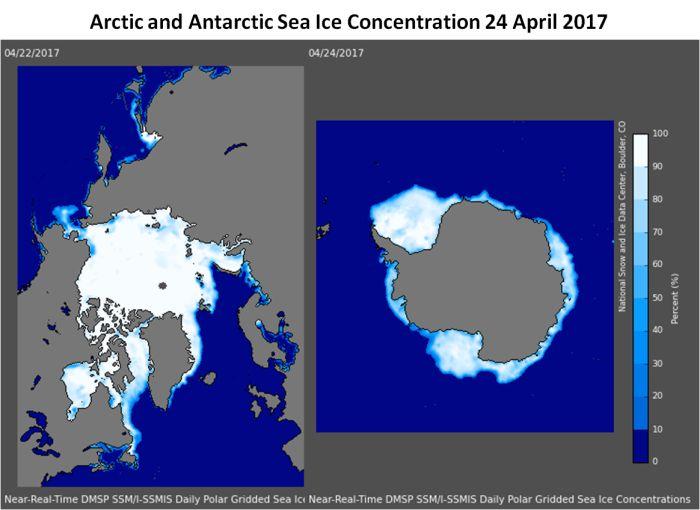
Figure 15 – Polar ice extents for 6 April 2017 (maps produced using the Charctic Interactive Sea Ice Graph application using the publicly available satellite data on sea ice from the US National Snow and Ice Data Center).
Arctic melting is speeding up in April under increasing sunlight, the extent of the ice is essentially tied for the lowest for this date. Profound effects have also been observed over the last year on the thickness of ice on the Arctic Ocean in that almost all ice thicker than 2.5 meters has disappeared from the ocean as shown in Fig. 16. The PIOMAS graph (Fig. 17) shows the impact this melting has had on the total volume of Arctic ice.
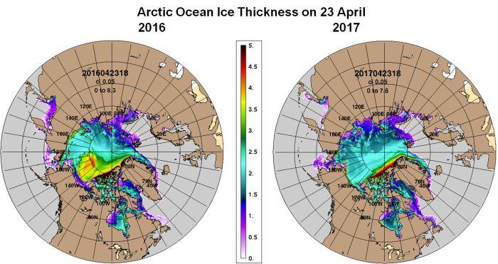
Figure 16 – Ice thicker than 2.5 meters has disappeared between 2016 and 2017 (CICE ice thickness – Snapshot Archive). Although the extent of the Arctic ice after the winter maximum begins to shrink in March, over the Arctic Ocean the thickest ice is seen towards the end of April. In 2016 over half the surface of the 90-180° W quadrant was covered by ice thicker than 2.5 meters. Excepting only thick ice piled up on the shores of the Canadian Archipelago and northern Greenland, one year later there was no ice left in the Arctic thicker than 2.5 meters. Also, around half of the remaining ice is now less than 1.7 meters thick..
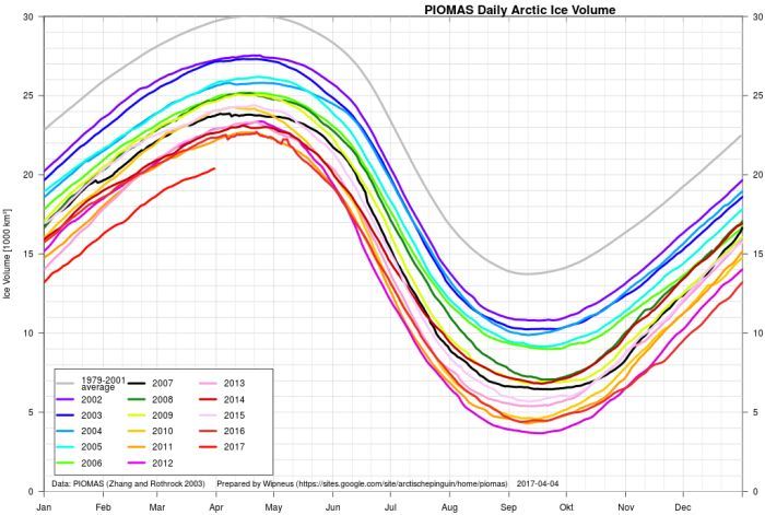
Figure 17 – Recent history of arctic ice volume changes through 1 April 2017. (Plot by Wipneus from PIOMAS data. See also PIOMAS Arctic Sea Ice Volume Reanalysis and Unified Sea Ice Thickness Climate Data Record.) If the present trend of melting continues through the September minimum, except for ice piled up against the shores of Canadian Archipelago and northern Greenland, the Arctic Ocean could be nearly ice free this year.
The low amount of sea ice at both poles means that the oceans will be absorbing much more heat energy from the sun than would be normal for this time of year – to encourage even more melting of the ice, as shown in the next graphic.
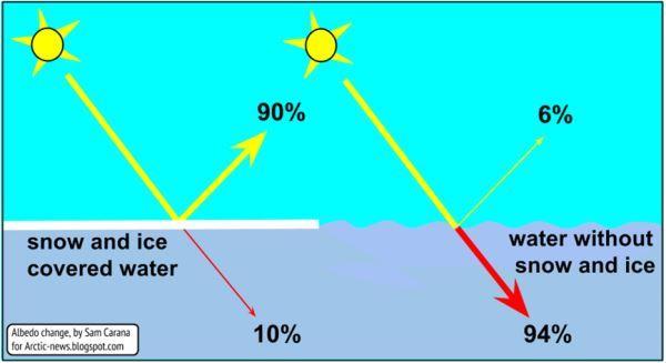
Figure 18 – The “albedo effect” (Arctic News). Snow and ice reflect around 90% of the solar energy striking them. Open water or dark soil generally absorb around 90% of the solar energy they receive. The absorbed energy heats the absorbing medium, increasing its temperature until there is a balance between heat leaving the area via conduction, convection, or radiation.
The net effect for this time of year from from the energy absorbed by the oceans in the summer is to impede freezing (in the Arctic) or to continue melting (in the Antarctic). Given that much of the remaining ice even in early stages of the melting season is quite thin (under 2 m thick), it will be readily fragmented by wind and waves to speed melting. Except for the thick ice along the shorelines of the Canadian Archipelago and northern Greenland, it is possible we will see an ice-free Arctic Ocean for a while this summer or next. If the reduction in volume compared to the previous lows shown in Fig. 17 continues through the rest of the year through September (around 2,000 km3) that would leave only around 1,800 km3 of ice on the ocean. Given that fragmented ice melts faster, it could be even less. While the ocean is mostly ice-free summer warmth will no longer be absorbed by the melting process (see Fig. 8), and the air temperatures in the high Arctic are likely to become substantially warmer – causing who knows what knock-on effects.
The heat anomalies in the Arctic are clearly slowing the rate at which new ice forms, even leading to an episode of net melting from December 18 through December 25 – at a time of year when the sun was below the horizon and could not contribute solar energy to add heat to the system. This suggests that major changes are taking place in the weather systems that normally lead to a rapid freeze-up of the Arctic Ocean. We can speculate where the anomalous heating comes from:
- Water currents, e.g., the Gulf Stream may be hotter or flowing faster and further north than it usually does in the area between Svalbard and Scandanavia/Russia. However, a flow of warm water from the Pacific is limited by the shallow depth and narrow width of the Bering Strait
- Southerly winds may be bringing more heat into the Arctic.
- A stronger greenhouse cap over the Arctic. Water and ice have very high heat capacities, and cool via convection (transfer of heat from warmer to cooler air or water), or radiation (Arctic winters are generally stable and clear, allowing virtually all radiant energy given off by water or ice to escape to outer space). However, if the Arctic region is capped by a strong greenhouse layer, radiant energy given off by freezing water and continuing radiation from ice still close to the freezing point kept “warm” by the conduction of heat from the still liquid ocean under the ice will be trapped in the atmosphere to impede cooling of the surface as indicated by anomalously high air temperatures in the Arctic. Water vapor/clouds, CO2, and methane can all contribute to a stronger greenhouse cap.
5. Some relevant phenomena
As mentioned in the introduction to this essay, climate conditions in the Arctic drive world climates via their impacts on the Northern Hemisphere’s jet stream winds and ocean currents. In this section I will review some of these drivers and feedbacks affecting them.
5.1. Complexity theory: non-linearity, negative and positive feedback, and chaos
Local weather is the consequence of the interactions of a multitude of variables in a dynamic and complex physical-chemical system involving the sun, Earth’s atmosphere, oceans and other water bodies, the land and components of the biosphere that determine local temperatures, winds, and precipitation. Meteorologists aided by supercomputer models and the statistical analysis of many years of historical evidence that can be used to constrain the models now understand this complexity well enough to give reasonably accurate predictions up to several days in advance.
It is very difficult to model the behavior of weather systems because there are many interacting variables, and few if any of these interactions behave in a linear fashion (i.e., “linearity” is where there is a strict proportionality between the value of a any “independent” variable and the value of a variable it controls). Systems that include interactions that are not linear are termed “nonlinear systems“). Also, the values of a fair number of climate variables feed back on themselves, such that an increase in the one variable may cause changes in other variables that in turn affect the value of the first variable.
- “Positive feedback” is the case where a change in the first variable causes other changes that feed back onto itself so as to cause the variable to change at a still faster rate. In other words positive feedback amplifies the extent of the change in either direction.
- “Negative feedback” is where the change feeds back on itself to actually reduce or damp the rate of positive or negative change.
Nonlinear dynamic systems with positive and negative feedback are often termed as chaotic. What this means is that no two repetitions starting from the virtually identical initial conditions will be similar after a significant period of time (say a month where real climates are concerned). On the other hand, the range of variation in important climate parameters seem to be constrained to stay within approximate boundaries – such that the large scale behavior of climate systems can be modelled in probabilistic terms.
5.2. Jet streams and the polar vortex
Under “normal” conditions as understood in the era of scientific climatology, a strong vortex of winds forms in the stratosphere above the Arctic Ocean, with dry stratospheric air drawn down into a high pressure region encircled by a tight vortex of low level easterly winds blowing outward from the periphery of the vortex. When the vortex forms the freezing stratospheric air grows warmer as it slowly descends, preventing cloud formation (but it is still very cold compared to the temperatures of ice, snow, ocean and continental) and allowing the easy radiation of heat to space enabling rapid cooling of ice and water on the surface of the Ocean. As long as the high Arctic remains much colder than lands to the south the polar vortex remains strong and maintains a “tight” and nearly circular arctic jet stream as a wall between the air mass of the frigid Arctic winter and the warmer lands and oceans to the south.
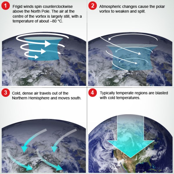
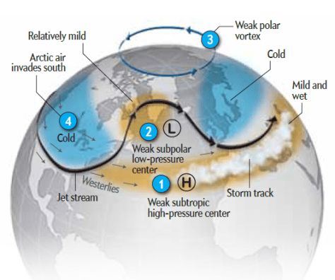
Figure 19 – The Polar Vortex. A strong polar vortex (1) leads to rapid freezing of the Arctic Ocean due to descending dry and frigid air and the rapid radiation of heat stored in the open ocean and recently frozen ice to outer space. If the vortex weakens it can break down (2-4) allowing major allowing icy air to flow south. Snow insulates sea ice and the land allowing cold air flowing south from a weak vortex to become even colder, bringing extreme cold air to temperate zones of the continents. (Eco West)
A comprehensive explanation of how the polar vortex and its associated jet streams works is provided by John Mason (2013) in his post, “A Rough Guide to the Jet Stream: what it is, how it works and how it is responding to enhanced Arctic warming“. This explains how a reduced temperature difference between the pole and temperate latitudes leads to a weaker and more meandering jet stream.
Under “normal” conditions the jet stream forms regular north-south meanders of moderate amplitude that progress eastward around the planet driving weather systems before them. This is called “zonal flow” (see image below). Arctic air masses are held north of the jet stream, while the hotter tropical air is held to the south.
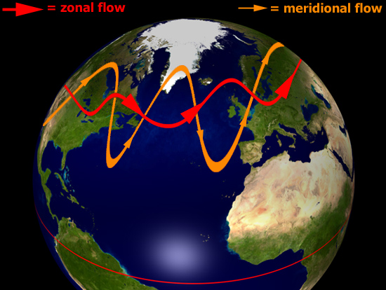
Figure 20 – Typical zonal (red) and meridional (orange) jet stream paths superimposed on part of the Northern Hemisphere (Mason 2013). The relatively small north-south waves in zonal flows progress from west to east around the polar region and help to form a stable barrier between polar and temperate air masses. Extreme meridionality slows or even stops the eastward progression of waves and can bring very cold air flooding a long way south from the Arctic while warm air is able in a different sector to force its way into the far north to cause prolonged cold/wet and hot/dry spells in the respective sectors.
With a reduced temperature difference between arctic and temperate latitudes (e.g., as a consequence of arctic warming) the meanders increase and may even break off as separate vortexes in what is called “meridional flow”. More significantly, the eastward progress of the meanders may slow or even stop. Arctic air can then flow southward on the north side of meanders as far as the sub tropics, and tropical air can be brought well up into the arctic zone on the south side of north extending meanders.
What is even more damaging is that these extreme weather conditions can persist in the same area for many days or even weeks, causing severe stress and to people and natural ecosystems from the record high or low temperatures. In winter, during these southern excursions over continents insulated by snow, the air can become substantially colder that it was over the Arctic Ocean. Also, under these meridional conditions large masses of warm air can be brought as far north as the Arctic Ocean where they add still more heat to the system to further reduce average temperature differences.
5.3. Thermohaline circulation and ocean currents
Global ocean currents are also of major importance in governing global climates due to the capacity of water to absorb, move, and release very large amounts of heat around the planet.
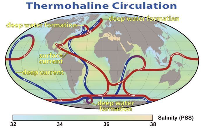
Figure 21 – The thermohaline circulation also known as “meridional overturning circulation” (Wikipedia: Robert Simmon, NASA. Minor modifications by Robert A. Rohde – NASA Earth).This collection of currents is responsible for the large-scale exchange of water masses in the ocean, including providing oxygen to the deep ocean. The entire circulation pattern takes ~2000 years.
Basically, aside from prevailing winds pushing along surface water, the overall current system is driven by the physical fact that salty cold water is substantially heavier/denser than hotter and fresher water. The dense salty and cold water sinks to the bottom of the ocean and fresher and warmer water is pulled in to replace it.
The saltiest water forms in the Atlantic Ocean due to the continued evaporation in the hot tropics and subtropics (Mediterranean water is saltier but little of this reaches the Atlantic). This salty Atlantic water is still hot enough to flow north over the top of fresher but cooler waters until it reaches the Arctic where the salty water eventually cools enough to sink to the bottom. The cold salty water forms a deep current that flows south as far as the Antarctic where it then flows eastward along the bottoms of the Indian and Pacific Oceans where it gradually mixes and warms enough to again become surface water flowing into the Atlantic from the Pacific (to the west) and Indian Ocean (from the east). Along the way, as the Gulf Stream, the warm current substantially warms the East Coast of the USA, southern Canada, western Europe and northern Scandanavia.
The important consideration here is that the whole circulation pattern is driven by the fact that the salty warm water becomes cold enough in the Arctic that it sinks to the bottom to draw in more surface water. If the surface water in this region becomes too fresh (due to the melting of glacial ice – especially of the Greenland Ice Cap) and warmer (due to a general warming of the Atlantic side of the Arctic Ocean) due to global warming, the water will stop sinking and the thermohaline circulation will diminish, stop, or perhaps even begin to work in reverse. This would have catastrophic climate effects on continental areas currently warmed by the Gulf Stream that may then become very much colder in winter. Detailed explanations and discussions are provided by Wikipedia’s Thermohaline Circulation, and Shutdown of Thermohaline Circulation; Carbon Brief’s The Atlantic ‘conveyor belt’ and climate: 10 years of the RAPID project; and Real Climate’s The underestimated danger of a breakdown of the Gulf Stream System.
5.4. Other feedbacks
The most obvious positive feedback affecting the melting of sea ice is the interaction between summer sun and the ice: As sea ice melts less solar energy is reflected back to space and more is absorbed to warm the adjacent ocean. The warmer sea water speeds melting of more sea ice. As shown below, as the Arctic Ocean becomes more open due to rapid melting of the sea ice larger waves can form that assist in the breaking up and melting of sea ice. The graphic shows some of the less obvious sources of positive feedback that may contribute to a rapid breakup of the remaining sea ice – possibly over only a couple of years, and even faster arctic warming than we have contemplated.
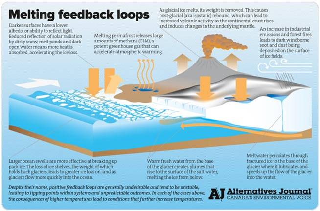
Figure 22 – A Canadian view of potential sources of positive feedback that may lead to a chaotically rapid increase in the rate of melting of arctic sea and glacial ice. (Alternatives Journal)
6. Where are we now and how did we get here?
6.1. What the observations seem to tell us
The vast multitude of climate observations summarized above provide overwhelming evidence that the global, and especially arctic climates are rapidly warming at geologically unprecedented rates that may have accelerated markedly over the last 2-5 years. Coincident with this is a rapidly accelerating shrinkage in the extent, area, and volume of polar sea ice to what was in the first three months of 2017 the lowest levels that have been measured during the satellite era beginning in 1979 (see Fig 1).
Although not discussed in this essay, there is plenty of evidence in the news and on the web that the increasing temperatures have produced high frequencies of extreme weather events such as droughts, extensive wildfires (especially in Canadian and Russian boreal forests), and ecosystem collapses (Californian oak and pine forests, kelp forests, coral reef and mangrove systems, tropical peat forests – e.g., Indonesia, central Africa). Arguably, much of the recent disorder in Syria, other areas of the Middle East, and Africa is a consequence of the drought-induced collapse of subsistence agricultural ecosystems.
“Atmospheric rivers” in the air (see Every 200 years California suffers a storm of biblical proportions — this year’s rains are just a precursor) have apparently ended five years of what has been one of California’s worst droughts in the modern record where the state’s agricultural ecosystem may have been on the verge of collapse (LA Times, 12 January 2017). However, as the world continues to warm such agricultural collapses and associated famines become increasingly likely.
6.2. Greenhouse gasses: H2O, CO2 and methane (CH4)
Atmospheric water vapor (H2O) is the most important natural (as opposed to man-made) greenhouse gas, accounting for about two-thirds of the natural greenhouse effect. However, its role in climates and its response to changing global temperature are difficult to assess because many of the processes involved in its spatial and temporal distribution are still poorly understood.
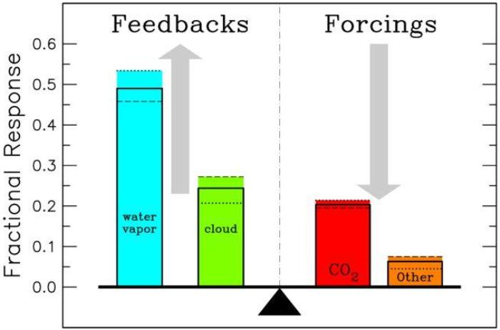
Figure 23 – Atmospheric components contributing to the greenhouse effect. Dotted and dashed lines depict the fractional response for single-addition and single-subtraction of individual gases to either an empty or full-component reference atmosphere, respectively. Solid black lines are the scaled averages of the dashed and dotted line fractional response results. The sum of the fractional responses must add up to the total greenhouse effect. The reference model atmosphere is for 1980 conditions. (Wikipedia)
Modeling found that water vapor accounts for about ~50% of the Earth’s greenhouse effect, with clouds contributing ~25%, carbon dioxide ~20%, and the minor greenhouse gases (GHGs) and aerosols accounting for the remaining ~5%, as shown in Fig. 23. As explained below and in Fig. 24, the strength of the local H2O greenhouse effect and the potential amount of precipitation depend on the amount of water in the atmosphere both as water vapor and as visible clouds, roughly measured as “precipitable water“. It is also important to know that when H2O vapor condenses into cloud or rain droplets the process of condensation releases a large amount of heat (heat of condensation). Similarly, when water evaporates from cloud droplets, the ground, or the ocean it absorbs heat from its surroundings. (see enthalpy of vaporization). CO2, methane and other “non-precipitable” greenhouse gases only account for ~25% of the total greenhouse effect, but it is these non-condensing GHGs that actually control the strength of the greenhouse effect because the contributions from water vapor and cloud depend on temperature dependent sources of evaporation, and as such, only provide amplification. Because carbon dioxide accounts for 80% of the non-condensing GHG forcing in the current climate atmosphere, atmospheric carbon dioxide and methane are primary controls governing the Earth’s temperature (Schmidt, et al. 2010. The attribution of the present-day total greenhouse effect)
The figure below is a view of atmospheric precipitable water in a typical Northern Hemisphere winter. Note that large areas of the polar regions are extremely dry – essentially cloudless with comparatively little water to contribute to a greenhouse cap. With close to zero H2O vapor or clouds in the atmosphere only the non-condensing gases (mainly CO2 and methane) will be contributing to any greenhouse.
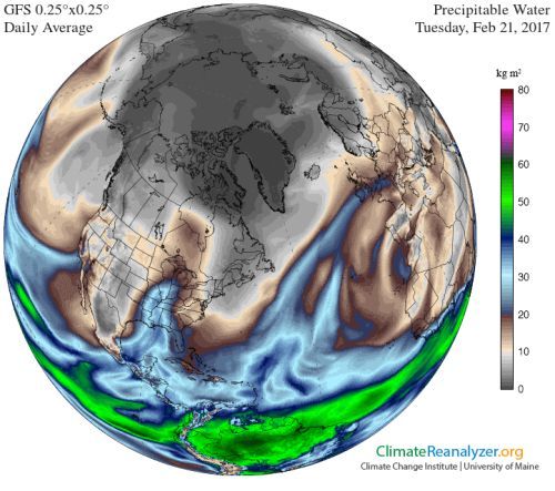
Figure 24 – Global distribution of precipitable water in deep winter on 21 February 2017. Note that the low levels of atmospheric moisture in the Arctic winter will not contribute to any polar greenhouse cap that may exist. Note also that there is an atmospheric river impinging on Southern California.
However variation in the amount of the H2O-based greenhouse (especially in the dark times of the arctic winter) will contribute significant positive feedback (i.e. to increase warming) to the greenhouse potential of other greenhouse gases present in the arctic atmosphere. How this works is described by Burt, et. al., 2016 – Dark Warming, as summarized in the next graphic:
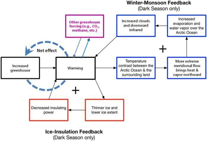
Figure 25 – Schematic of the ice–insulation and “winter monsoon feedbacks”, which operate during the “dark season” when there is no direct solar heating (modified from Burt, et. al., 2016). As the arctic greenhouse traps more heat over the arctic more ice will melt and more precipitable water will both contribute to increasing the amount of greenhouse warming. As discussed below, other gases, e.g., CO2, methane, etc. are involved in other feedbacks contributing to warming.
To reverse the positive feedback from warming, we have to do something to reduce the net greenhouse.
CO2 and to some degree, methane, are the only parameters under human control. They must be reduced enough to cancel out other contributors that humans cannot control such as H2O and methane released from geological sources such as peat bogs and melting permafrost. As will be seen, we may soon be reaching a point of no return where even zero carbon emissions would be insufficient to actually reduce the greenhouse being enhanced by non-anthropogenic greenhouse gas emissions. The next image (Fig. 26), links to a NASA video modeling changes in CO and CO2 concentrations over the course of 2006 from natural and human generated emissions and absorptions. Fig. 27 links to an NOAA, Earth System Research Laboratory animation tracing the historical variation on CO2 concentration from 800,000 years ago through glacial, interglacial, postglacial and industrial eras up to the present.
Figure 26 – NASA image of variations in CO2 concentrations around the world based on sources of emission (generally the darkest red areas) and absorption (generally the lightest colored areas). (Goddard Media Studios). Click here for A Year in the Life of Earth’s CO2) that shows the yearly cycle of emission and absorption.
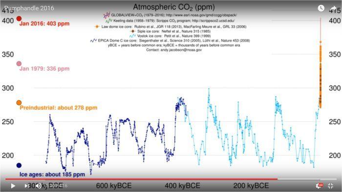
Figure 27 – Animated history of CO2 concentrations from 800,000 years BP to January 2016. Click the graphic to begin the animation. As it begins, the left panel shows the annual variations CO2 concentrations at various latitudes from the South Pole to (blue dot) through Mauna Loa (red dot) to measuring locations in the Arctic. Open dots are various other locations. The top part of right panel shows a map of monitoring locations and the date. The lower part of the right panel shows a graph of the variation in CO2 concentration from January 1979 when measurements at the South Pole began to the current date. When January 2016 is reached, the Mauna Loa curve is traced backward to 1958 when recordings were started by Charles D. Keeling. When 1958 is reached, CO2 concentration for earlier dates is then measured from gas bubbles trapped in radioactively dated Antarctic ice core slices, the oldest of which goes back 800,000 years before present. This shows how extraordinarily rapidly CO2 concentrations have risen in the Industrial Age from a maximum of 300 ppm any time prior to the beginning of the Industrial Era when humans began burning fossil fuels on an industrial scale to over 400 ppm now. As shown in the credits organizations from many nations contributed the data summarized here. (NOAA, Earth System Research Laboratory, Trends in Atmospheric Carbon Dioxide)
CO2 and H2O are not the only gases contributing to changes in the strength of the greenhouse. Although it is measured in parts per billion (ppb) rather than parts per million (ppm), methane (CH4) is between 20 and 80 times more potent as a greenhouse gas than CO2 (depending on the time period under consideration). Its concentration in the atmosphere is also rising much faster than CO2. In the industrial era, CO2 concentration rose from around 275 ppm to the current level of more than 400 ppm – an increase of around 46% during this time. In the same period methane rose from 700 to around 1850 ppb (= 1.85 ppm) – around 164% of the original value depending on what year was taken as the baseline. (see Fig. 28).
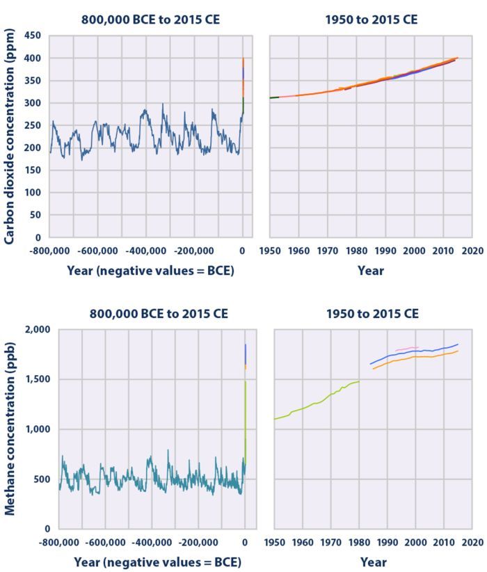
Figure 28 – Changing CO2 and methane concentrations through time from 800,000 years before present up to 2016. (US EPA Climate Change Indicators.
We have a reasonable understanding of sources and sinks for anthropogenic and non-anthropogenic CO2. Some of the atmospheric methane has clearly been released as the result of human activities, e.g., the raising of cattle and other ruminants, mining and drilling for oil and gas, leakage from a variety of other industrial activities etc. The fast rise in methane concentrations in parallel with the expansion in animal husbandry and industrial activities suggests that its rise in atmospheric concentration is also a consequence of human activities. However, compared to CO2 which has a atmospheric lifetime of many centuries because it is “permanently” removed from from the atmosphere/biosphere only by relatively slow geological processes, methane has a short lifetime (around 10 years) before it is degraded by hydroxide radicals and sunlight into CO2 and water.
As shown in Fig. 29, over the period from ~1980 the atmospheric concentration of CO2 has been rising at an accelerating rate, while the concentration of methane plateaued from 1989 through around 2007. This suggests that the rates of methane emission and degradation were in approximate equilibrium during this period. Beginning around 2008 the concentration of methane again began to rise more or less in step with the increasing temperature anomalies in the Arctic around 2008 (See Fig. 4 and Fig. 8). It is possible that a rapidly growing fraction of methane began to be released around that time from peat bogs in the boreal forests and permafrost under tundra and the Arctic Ocean that were exposed a times of lower sea levels during the ice ages.
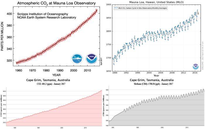
Figure 29 -. Rising concentrations of CO2 and methane in the atmosphere from ~1980 to January 2017 as measured at Mauna Loa, Hawaii and Cape Grim, Tasmania, Australia. Both sites have been selected to record baseline measurements because because they are as far removed as practical from local sources of CO2 and methane production. The cyclic variation in CO2 concentrations is due to the absorption of the gas by plants during the growing season and then release as they decay over autumn and winter. The variation in methane is a consequence of its light induced breakdown in spring and summer compared to its stability and continuing emissions during the dark seasons. (Mauna Loa observations from NOAA Earth System Research Laboratory Trends in Atmospheric Carbon Dioxide and Carbon Cycle Gases, MLO, Methane. Cape Grim observations from CSIRO, Cape Grim Greenhouse Gas Data.)
Fig. 30 shows the degree to which different gases released by human activities contribute to the greenhouse effect. CO2 makes the largest contribution, followed by methane. Fig. 31 shows how much the forcing from each gas has increased between 1980 and 2015.
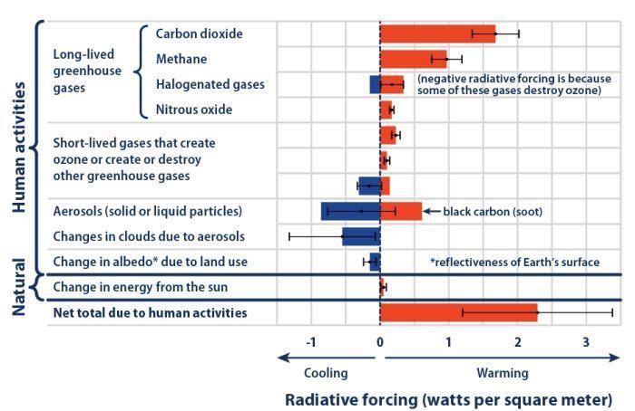
Figure 30 – Contributors to global warming (US EPA – Climate Change Indicators: Climate Forcing, see also Wikipedia: Radiative Forcing).
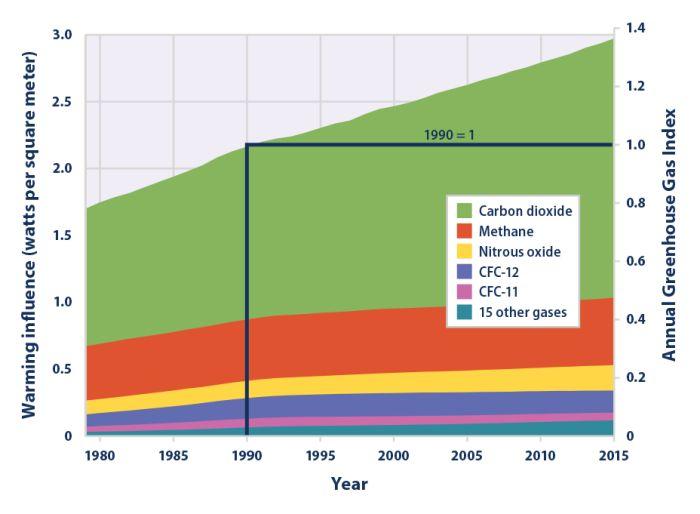
Figure 31 – Changes in radiative forcing by greenhouse gases between 1980 and 2015. (US EPA – Climate Change Indicators: Climate Forcing.
Fig. 32 is a dense graph summarizing a lot of information. The annual maxima and minima of methane concentration tend to increase year on year, with a suggestion that the rate of increase begins to accelerate around 2006. The valleys in the front extending from the south pole to around the equator show annual minima autumn and maxima in spring. This is that because of shorter day lengths methane accumulates faster in winter than it breaks down and summer sunlight drives the chemical processes that oxidize methane into CO2 and water. The broad picture in the northern hemisphere where the seasons are reversed is the same. However, the most significant observation is that the highest concentration of methane occurs over the Arctic Ocean, where the concentration is also rising the fastest, with the lowest rise and rate of rise over Antarctica. This suggests that most methane is released in high latitudes where its rate of release exceeds its rate of decomposition. Decomposition rates are highest under the equatorial sun, but the increasing concentrations of methane still spill over the Equator into the southern hemisphere to drive rising concentrations even at the South Pole.
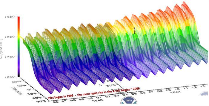
Figure 32 – Changes in the global distribution of methane from 1996 through 2013. The x-axis (left-right) plots each month from 1996 through 2013, the y-axis (in-out) plots latitude from the north pole to the south pole, and the z-axis plots methane concentration in nanomoles/mole (= parts per billion).
6.3. Arctic Methane
The obvious conclusion here is that the major source of methane emissions is in the industrial north, and probably even from the basically non-industrialized high Arctic. The actual sources of methane emission have not been as well studied and quantified as CO2 emissions, but it appears that major arctic sources may be emissions methane from anaerobic fermentation and CO2 in boreal peat and tundra bogs, and the release of “fossil” CO2 and methane stored as ice-like hydrates (= clathrates) in permafrost laid down on land and shallow continental shelves during low sea-level periods of the ice ages as these warm and melt in the increasingly hot Arctic. Rates of greenhouse gas release from all of these sources increase with rising temperatures. Of these, methane is the least well understood.
Aside from forest bogs, an unknown proportion Arctic methane is probably emitted from thawing permafrost above and below the ocean surface – especially in areas that received organic rich sediment during the last glacial era when sea levels were some 100 to 200 m lower than they are today. The distribution of land based permafrost is shown here:
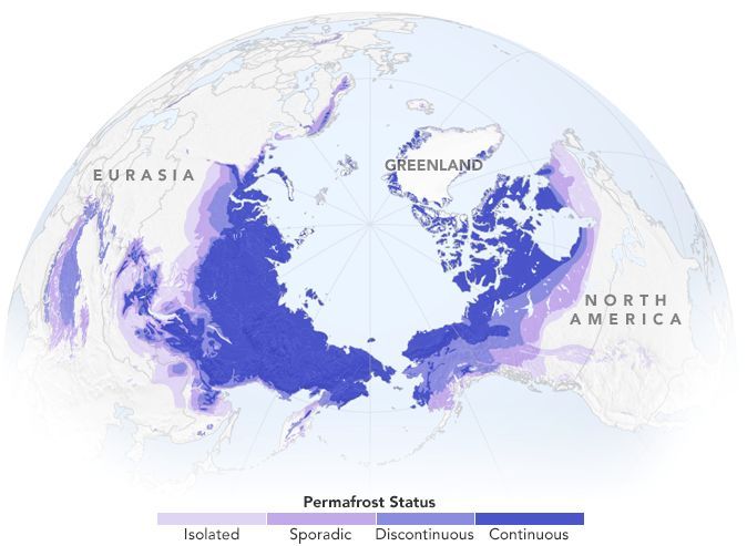
Figure 33 – Distribution of arctic permafrost (from NASA Earth Observatory’s Methane Matters).
The following pictures from the Siberian arctic and their associated articles suggest this kind of outgassing may prove to be a major issue for continuing life as we know it.
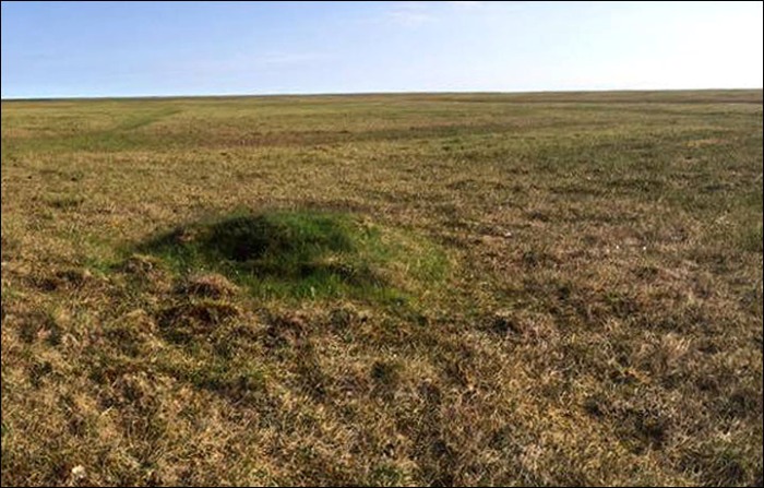
Figure 34 – The hillock visible here is actually a bubble of methane trapped under the tundra (The Siberian Times – 22 Jul 2016). This dome was like jelly to walk on, and filled with meltwater and methane gas. After removing the layer of grass, when sampled the air around it proved to be full of methane gas. “The carbon dioxide (CO2) concentration released was 20 times above the norm, while the methane(CH4) level was 200 times higher”.
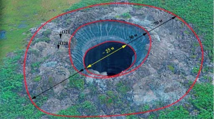
Figure 35 – This is probably the same crater as depicted in the illustrations below. “The vent has many features similar to a volcano. A central vent surrounded by debris ejected from it that forms the parapet. Initially the parapet will have been much larger (taller) and made up of ice blocks that have subsequently melted” (Mearns, 2015 – On the Origin of a Permafrost Vent on Yamal Peninsula, Russia).
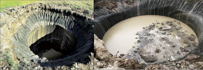
Figure 36 – Some hillocks, called pingos, are formed by the expansion of a column of ice within the permafrost that may also contain ice-like CO2 and methane hydrates (The Siberian Times – 10 July 2015). If the ice melts (increasingly likely with rising arctic temperatures), and the melting hydrates release gas, the gas pressure may cause the pingo to blow out spewing water, mud, and ice along with the released gases, leaving a hole like shown here that leaves easy access to the atmosphere for further emissions, and that gradually fills with debris. The blowholes eventually degrade into the millions of deep circular lakes in the tundra.
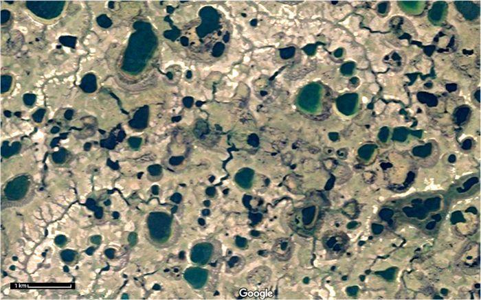
Figure 37 – A highly pitted landscape covered with water-filled permafrost “blow”holes on the tundra of the Yamal Peninsula (Yamalsky District, Yamalo-Nenets Autonomous Okrug, Russia – Google Maps 68°50’59.3″N+69°50’23.7″E – I have enhanced the brightness and contrast to clarify the image). The meandering streams collect and eventually conduct meltwater out of the landscape. The dark blue lakes are those that are still deep – not yet filled in by debris. The smallish lake – third in a near vertical straight row of five in the lower middle of the picture is ~170 m in diameter. There are also smaller similarly structured blowholes (such as those illustrated above, e.g., Fig. 35) down to the resolution of Google Maps.
Permafrost is known to store large amounts of CO2 and methane in ice-like hydrates that decompose into water and gas at temperatures around the freezing point. As heat from the warming climate penetrates ever deeper into the soil the ice and clathrates in the solid permafrost melt and turn into semi-liquid mush that releases any stored gasses as bubbles that can reach the atmosphere when the gas-filled structure bursts or collapses. From the evidence on the permafrost landscapes, where the permafrost layer is thick enough this gas appears to reach the atmosphere in an vigorous eruption, blowing out blocks of ice, water and gasses to leave a deep pit that soon fills with meltwater and debris leaving deep ponds as shown in the sequence of pictures above. These pitted landscapes can can easily be found as I have done here in Fig. 37 using Google Maps in Earth mode in alluvial deposits around the Arctic in Alaska, Canada, and Russia/Siberia.
As the Arctic warms, permafrost is melting at an increasing rate. More recently than the reports above, on 20 March 2017 a Siberian Times times article, “7,000 underground gas bubbles poised to ‘explode’ in Arctic“, reported that “scientists have discovered as many as 7,000 gas-filled ‘bubbles’ expected to explode in Arctic regions of Siberia after an exercise involving field expeditions and satellite surveillance”. These bubbles are like that illustrated above in Fig. 34. Similar structures have also been found on continental shelves in the Arctic as reported in the Siberian Times (18 Nov. 2015 – Leaking pingos ‘can explode under the sea in the Arctic, as well as on land’) as described in the Geological literature (Serov et al. 2015. Methane release from pingo-like features across the South Kara Sea shelf, an area of thawing offshore permafrost, published in the Journal of Geophysical Research: Earth Surface).
The amount of greenhouse gas released per year by this process is very poorly quantified, with estimates ranging over two factors of 10. Ruppel and Kessler in a 2017 preprint of an open access article, “The Interaction of Climate Change and Methane Hydrates” published by the American Geophysical Union in Reviews of Geophysics present from a conservative point of view the current range of understanding and opinions regarding the relationships between currently frozen methane and global warming.
The review’s conclusions are worth quoting verbatim:
On the contemporary Earth, gas hydrate is dissociating in specific terrains in response to post-LGM [Last Glacial Maximum] climate change and probably also due to warming since the onset of the Industrial Age. Nevertheless, there is no conclusive proof that the released methane is entering the atmosphere at a level that is detectable against the background of ~555 Tg yr-1 CH4 emissions. The IPCC estimates are not based on direct measurements of methane fluxes from dissociating gas hydrates, and many numerical models adopt simplifications that do not fully account for sinks, the actual distribution of gas hydrates, or other factors, resulting in probable overestimation of emissions to the ocean-atmosphere system. The new generation of models based on ocean circulation dynamics holds the greatest promise for robustly predicting the fate of gas hydrates under climate change scenarios [Kretschmer et al., 2015] and could be improved further with better incorporation of sinks.
At high latitudes, the key factors contributing to overestimation of the contribution of gas hydrate dissociation to atmospheric CH4 concentrations are the assumption that permafrost-associated gas hydrates are more abundant and widely distributed than is probably the case [Ruppel, 2015] and the extrapolation to the entire Arctic Ocean of CH4 emissions measured in one area. Appealing to gas hydrates as the source for CH4 emissions on high-latitude continental shelves lends a certain exoticism to the results, but also feeds catastrophic scenarios. Since there is no proof that gas hydrate dissociation plays a role in shelfal [sic] CH4 emissions and several widespread and shallower sources of CH4 could drive most releases, greater caution is necessary.
At present we do not know how much of a threat is represented by the emissions of methane from non-anthropogenic sources in the arctic because too little research has been done to accurately quantify either the magnitude of the emissions or how much methane more methane would be released as a consequence of atmospheric and ocean warming. We know that all of the rate of methane emissions from a variety of different will increase with rising temperatures, and that the addition of more methane to the polar atmosphere will cause temperatures to rise still faster. However, we know too little to quantify the positive feedback on the overall global warming process in terms of either the rate or magnitude of the additional warming.[my emphasis] For marine settings, the emerging research underscores the vulnerability of upper continental slope hydrates to ongoing and future dissociation in response to warming intermediate waters. In light of predictions that thousands of methane seeps remain to be discovered [Boetius and Wenzhofer, 2013; Skarke et al., 2014] on the world‘s continental margins, surveys should focus on identifying sites of possible upper continental slope gas hydrate breakdown and degassing. Such research should better constrain hydrate reservoir dynamics, CH4 release, and carbon cycling in response to climate forcing. As on the circum-Arctic Ocean shelves, it is important to continue investigating the source of CH4 emissions on upper continental slope to prevent attributing too much to hydrate dynamics, and establishing clear linkages between CH4 emissions and known gas hydrates is critical for proving the climate-hydrates interaction. At the same time, focused paleoceanographic studies should also constrain bottom water temperature changes on upper slopes since 20 ka, the critical period for placing present-day emissions in the context of post-LGM climate and oceanographic changes.
The authors’ views here regarding current methane emissions are conservative, but accepting of the limited knowledge presently available relating to the problem. However, they clearly identify the fact that the rate of methane release is likely to increase considerably as the atmosphere and oceans grow warmer and speed the melting of permafrost on land and on the continental shelves.
Regarding the question of whether this non-anthropogenic source of methane is contributing to polar warming now, I remind readers of the observational data reflected in the accelerating increase in Arctic temperatures in the current century and the persistent location in the sunless months of the year of the most extreme and stable anomalies over the permafrost of sedimentary areas of the high Arctic of North America and Siberia and the adjacent continental shelves. To me this suggests that a strong greenhouse cap is forming over these regions in autumn and winter, trapping heat from ocean and ice that would otherwise radiate away to outer space as was the case in the 20th Century.
7. How should we react to the observed global warming?
The the material presented above summarizes a vast array of observational data regarding global climate change – especially changes in average temperatures over time. The observations are from government and institutional sources I trust and respect and are fully live-linked to their sources which explain how the data have been collected and processed to produce the summaries I present here. How we should react to these and similar observations depends on how we assess adverse risks that may be a consequence of possible future climate changes that can be projected from the observations.
7.1. Engineers and project managers have to assess risks
Engineers and managers of all kinds of projects have developed some useful tools to help them think about, assess and quantify the range of possible physical and financial risks to operators, owners, and the general public associated with the engineered product, project or event in order to assess the viability of the project and the potential consequences if it should fail. (Risk analysis was one of the disciplines I had to understand and apply in my work for Tenix Defence – designer and builder of the ten ANZAC frigates for Australia and New Zealand – as a knowledge management systems analyst, designer and implementer.)
Thinking about project risks generally begins by creating a rectangular matrix for each identified risk, involving the dimensions of “likelihood” (probability of occurrence) and “consequences” (magnitude or cost if the risk happens) – see Risk Management.. Normally there are five degrees of likelihood – from rare to almost certain, and four of consequences – from insignificant to catastrophic. Given the nature of the possible risks associated with climate change, I have added a sixth level of consequence – “existential”, as explained in the slide graphics below (see Wikipedia on Permian-Triassic Extinction Event and Mass Extinctions).

Figure 38 – Defining the concepts of risk and “existential” risk. (William Hall (2016) – Slide 9, The Angst of Anthropogenic Global Warming: Our Species’ Existential Risk).
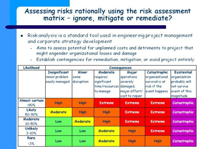
Figure 39 – A generic risk matrix for assessing risks that may be existential (William Hall (2016 – Slide 10, The Angst of Anthropogenic Global Warming: Our Species’ Existential Risk).
If the adverse consequences of a risk are unlikely and are insignificant or minor if they happen, it may be most cost effective to “ignore” the risks, and simply remediate any problems that arise if/when the adverse event being considered happens. On the other hand if the risk is high (or extreme), and if there is any possibility that the adverse event will happen, then the organization may well decide not to proceed with the project (i.e., to avoid the risk), or, alternatively, decide to spend what is required to mitigate (i.e., to remove) the possibility to ensure that the event cannot happen.
And then there are existential risks where the adverse consequence being considered may possibly cause the extinction of the organization, country, or even most or all of humanity, we are well advised to do everything possible to ensure that the adverse event doesn’t happen. For example nuclear war is an existential risk for a nation. It would be utter MAD-ness to organize a nuclear strike against another well equipped nuclear power with second-strike capability, because this would lead to a high probability that the nation that launched the first strike would be obliterated. Because the consequences would be so bad for all the parties involved and much of the remainder of the world as well, no nation to now has been mad enough to start a nuclear war. Hence the Cold War doctrine of Mutually Assured Destruction.
7.2. Analyzing the risk of runaway global warming
It is not my purpose here to present a complete risk analysis for Arctic warming, but only to highlight that that there is a potential for runaway warming in the Arctic that exists as an existential risk for humanity through likely cascading effects (as discussed above) on the global climate. The global average temperature has already increased by around one degree centigrade/Celsius since the mid 1930s, and by significantly more than that in the Arctic – especially over the Arctic Ocean since regular satellite observations began in 1979 to fill in the gaps between the sparse records offered by the small number of land stations, research vessels and weather buoys. Given the nature of positive feedbacks already discussed above, this is likely to trigger accelerating rises in Arctic temperatures:
- higher water and air temperatures melt more sea, glacial ice faster and snow on the land
- reduced summer ice cover and arctic snow on land leads to absorption of more heat to increase temperatures of ocean and overlying air to melt still more ice and snow
- reduced temperature differences between Arctic and temperate zones weakens the polar vortex, changing zonal jet streams regularly progressing to the east, into the slowly progressing meridional jet streams meander widely and sometimes stop that bring hot and moist tropical air up to the Arctic and colder dry air down into the subtropics that may force temperatures into extremes that may last for days trap extreme temperatures over localities for days or even weeks a time to trigger floods, wildfires in boreal forests, droughts and other extreme weather
- wildfires deposit black ash on snow and ice, encouraging further heat absorption and melting
- warmer, fresher fresher ocean water from melting ice and snow plus increasing solar heating reduces thermohaline circulation, allowing still more summer heating and the Arctic, while allowing local sea level rises and colder temperatures in western Europe and northeast USA
- changing sea levels and reductions in the mass of ice caps and glaciers are likely to trigger local volcanism
- higher temperatures lead to more rapid melting of permafrost on land and on shallow continental shelves, releasing stored but likely large amounts of greenhouse gases stored in sediments during the ice ages, trapping absorbed summer heat in the atmosphere into and perhaps even through the dark winter months.
The illustration below summarizes the risk to humans if we cannot reduce the existing greenhouse cap over the Arctic faster than it is being increased by these geophysical processes in order to allow cooling and the freezing of more ice to proceed.
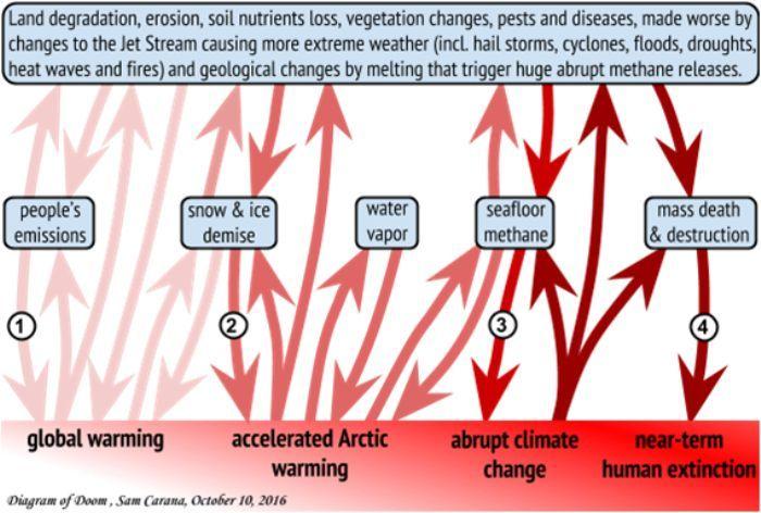
Figure 40 – Emissions from land-based permafrost may also contribute strongly to the Arctic greenhouse cap. (Arctic News, Near Term Human Extinction).
Could something like this actually happen to humanity? There is actually reasonably good evidence that runaway warming in the past has caused mass extinctions of life on Earth. A strong case has been made than the Permian-Triassic Extinction Event was caused by runaway warming at least partially as a result of a major methane belch from the oceans. It was the our planet’s worst extinction event, when some 96% of all marine species and 70% of terrestrial vertebrate species disappeared. It is the only known mass extinction of insects: some 57% of all families and 83% of all genera. Presumably, because of the great reduction in biodiversity, it took significantly longer than after any other extinction event for diversity to recover – possibly as much as 10 million years.
The scenario is described in by M.J. Benton in his 2008 book, “When Life Nearly Died: The Greatest Mass Extinction of All Time“. published by Thames & Hudson, London.” A 2016 report by Brand, et al. (Methane Hydrate: Killer cause of Earth’s greatest mass extinction, Palaeoworld 25(4), pp. 496-507), uses a number of physical methods to reconstruct a detailed time-line of the extinction event together with indicators of changes in temperatures and atmospheric events. Their conclusions need to be considered in the context of risks humanity presently faces from runaway global warming:
Carbon dioxide derived from Siberian Trap volcanism with its δ13C value of about −6‰ would bring about a warming of about 6 °C and a shift in marine carbonate 13C values by about −2‰.The rapid addition of isotopically lighter methane (∼−60‰) to the global atmosphere and hydrosphere would bump up the aver-age global temperature to well above 29 °C, and afteoxidationsthe 13C signature in marine carbonates would record carbon isotope compositions ranging from −2 to −7‰.
The emission of carbon dioxide from volcanic deposits may have started the world onto the road of mass extinction, but it was the release of methane from shelf sediments and permafrost hydrates that was the ultimate cause for the catastrophic biotic event at the end Permian.
The observational data presented in this essay provide strong evidence that significant Arctic warming has already begun that is apparently accelerating, suggesting that the ice-albedo feedback and polar vortex feedbacks are already operating, and that others may also have begun. Given (1) that the potential feedbacks mentioned here are all based on well established physics, geophysics and climatology, and (2) that they appear to be ongoing at the present time, it is entirely reasonable to assess the risk of adverse consequences to humanity as being existential.
The single most telling observation as to how far along this process we are is the catastrophic drop in the overall volume/mass of sea ice left on the planet as exemplified by the annually shrinking volume of Arctic ice shown by the following summary graphic from ArctischePinguin. For the period of 1979 through 2001 the average MAXIMUM volume of ice was 30,000 km3. From this year’s trend the peak would appear to be around 21,000 km3, which will be about 1,500 km3 lower than last year’s peak then tied to be the record low peak. Wipneus’s extrapolations of what appears to be an exponentially decreasing volume suggests that the Arctic Ocean may be ice free by the summer of 2020 – or perhaps even this year! Obviously, the actual minimum volumes of ice for each year bounce around above and below the trend line, so the first ice free summer could happen even sooner (or later) than when the trend line reaches zero. Nevertheless, if our planet loses its Arctic ice cap for even a short time that will probably be a unique event since at least since the last interglacial. The impact on temperate zone climates is not likely to be minor.
Figure 41 – Monthly variations in the total volume of sea ice on the Arctic Ocean from 1979 through 4 April 2017 as measured in thousands of cubic kms. Arctische Pinguin – PIOMAS / PIOMAS Daily Arctic Ice Volume)
In other words, the danger of extremely adverse consequences to our species if we deny or ignore the threat and do nothing to mitigate it can be ranked in three dimensions as:
- Probability: likely to almost certain
- Severity: catastrophic to extinction
- Time scale: near to imminent (i.e., within the normal lifespan of at least some people now living)
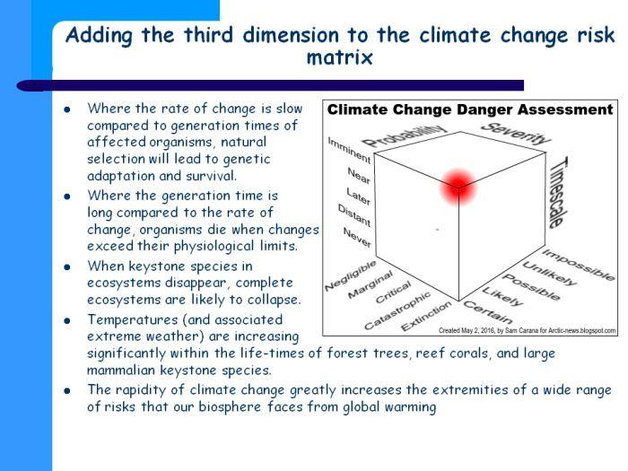
Figure 42 – Ranking the risk of runaway global warming in three dimensions. Above danger assessment adds a third dimension, i.e. time scale. A 5 – 10°C temperature rise could eventuate within one decade and this also makes the danger imminent, adding further weight to the need to start taking comprehensive and effective action. (Arctic News – The Threat Of Arctic Albedo Change).
My conclusion from what appears to be undeniable evidence canvassed in this essay is that we have already passed the tipping point where we had any hope of stopping warming at 2 or even 3 °C, and urgently need to focus on greatly improving our scientific understanding and learning learning how to live with and survive decades of rapid heating, and to develop global geoengineering tools to actively remove greenhouse gases from the atmosphere before most life on the planet (including ourselves) is exterminated by heat stroke and starvation in collapsing ecosystems.

.png)
This article was originally posted in May 2017. The world, and particularly the Arctic, has continued to grow warmer since then. My October 2019 presentation, We’re told we are facing climate and ecological emergencies: Is it so? What do we do about them? (http://orgs-evolution-knowledge.net/Index/Essays/Presentations/U3A/It's%20a%20Crisis!(web).pdf) updates the climate observations. This year, as described in a Facebook post on 28 June (https://www.facebook.com/william.hall.94214/posts/10220321115670650) Siberia has suffered months of the highest temperatures ever seen above the Arctic Circle. Taiga and tundra have burst into flame (probably due to spontaneous combustion as the consequence of the ‘compost bomb instability’ (https://www.yaleclimateconnections.org/2018/02/the-permafrost-bomb-is-ticking/). The permafrost is still burning today (https://www.washingtonpost.com/climate-environment/rapid-arctic-meltdown-in-siberia-alarms-scientists/2020/07/03/4c1bd6a6-bbaa-11ea-bdaf-a129f921026f_story.html).
If we haven’t already reached the threshold this year where runaway global warming will prove to be unstoppable, we must be very close. People need to organize and act to force our governments to mobilize globally to stop anthropogenic greenhouse gas emissions and begin extracting carbon from the atmosphere to reduce concentrations enough to allow some global cooling.
Given that it only took humans blindly using comparatively primitive technologies to get us to the precipice where we are now, it should be within our capacity to mount a focused effort to move back from the precipice.
LikeLike